Do you sometimes wonder how to pick colors to put together on your card design? I was trying to figure out what color would look pretty with these dragonflies I punched out from some hand-painted paper my sister sent me.� They are these beautiful shades of green. So I pulled out my color wheel to help me decide.
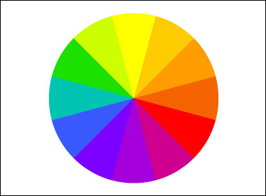
The color wheel is divided into 12 colors. Yellow, red, and blue will be the primary colors. Green, orange, and violet are the secondary colors. Each secondary color is a complement to one of the primary colors. To make it simple, the complement will be the color on the opposite side of the wheel. Green complements red (Merry Christmas!). Violet complements yellow (Happy Mardi Gras!). Orange complements blue (Happy umm…Parrot Day?).
I decided to go with three colors in a row and put the dragonflies on a daffodil yellow paper.
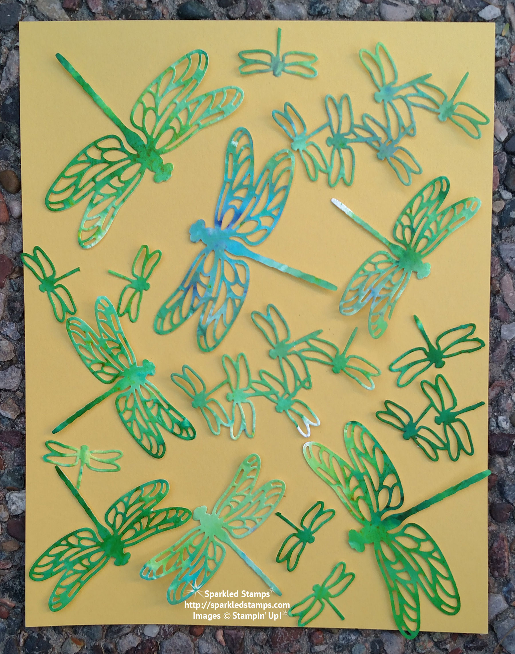
Do you just love those dragonflies??? The thinlit is called Detailed Dragonflies and you can read the details (lol) about it here.
Here are some tips about the color wheel.
- Opposite colors on the wheel will bring out a vibrancy that isn’t present when the color is used alone (the colors will pop).
- Three colors in a row will look harmonious together.
- Two or three adjacent colors with one opposite color will pop.

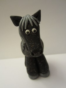 There’s a story to my Sparkled Pony name and you can read about it